Role
Sole Senior UX designer defining the mobile interaction model across gameplay and meta systems
Team setup
Pod-based structure per function. UX ownership across all pods
Impact areas
Gameplay HUD · Touch controls · Meta menus · Locker · Full match lifecycle flows
Timeline
9 months (initial scope: 4)
Problem framing
Interaction assumptions break on mobile
Epic Games was preparing to launch the Epic Games Store on mobile, and Fall Guys — live on console and PC for two years — was set to be part of that launch. My job was to adapt the game to feel native on mobile, without compromising the thing that mattered most: that it stayed a cross-platform game anyone could play with their friends, regardless of device.
Main UX pain points I identified early on to focus on:
→
Controller precision disappeared - huge friction in a platformer
→
Touch input and mobile HUD occluded gameplay space
→
Simultaneous actions like jump + grab became harder to execute reliably
→
Camera readability worsened under thumb coverage and reduced screen space
→
Shorter sessions changed flow pacing expectations: the game took too much time to load and the return to play flows felt unnecessarily long
Key decisions
We needed to smoothe the experience across gameplay and meta layers.
On the UX side, my plan of action covered 3 major areas:
01
Touch controls vs manual effort
Some decisions responded to mobile exclusive challenges:
Optimized button layout for comfort and camera control
Added an invisible touch buffer around buttons to reduce mis-taps and preserve screen visibility
Worked with the creative director to slightly increase jump height, compensating for reduced touch precision
Audited and reorganized the HUD for touch devices
One decision I'm very proud of came from watching, not from a request.
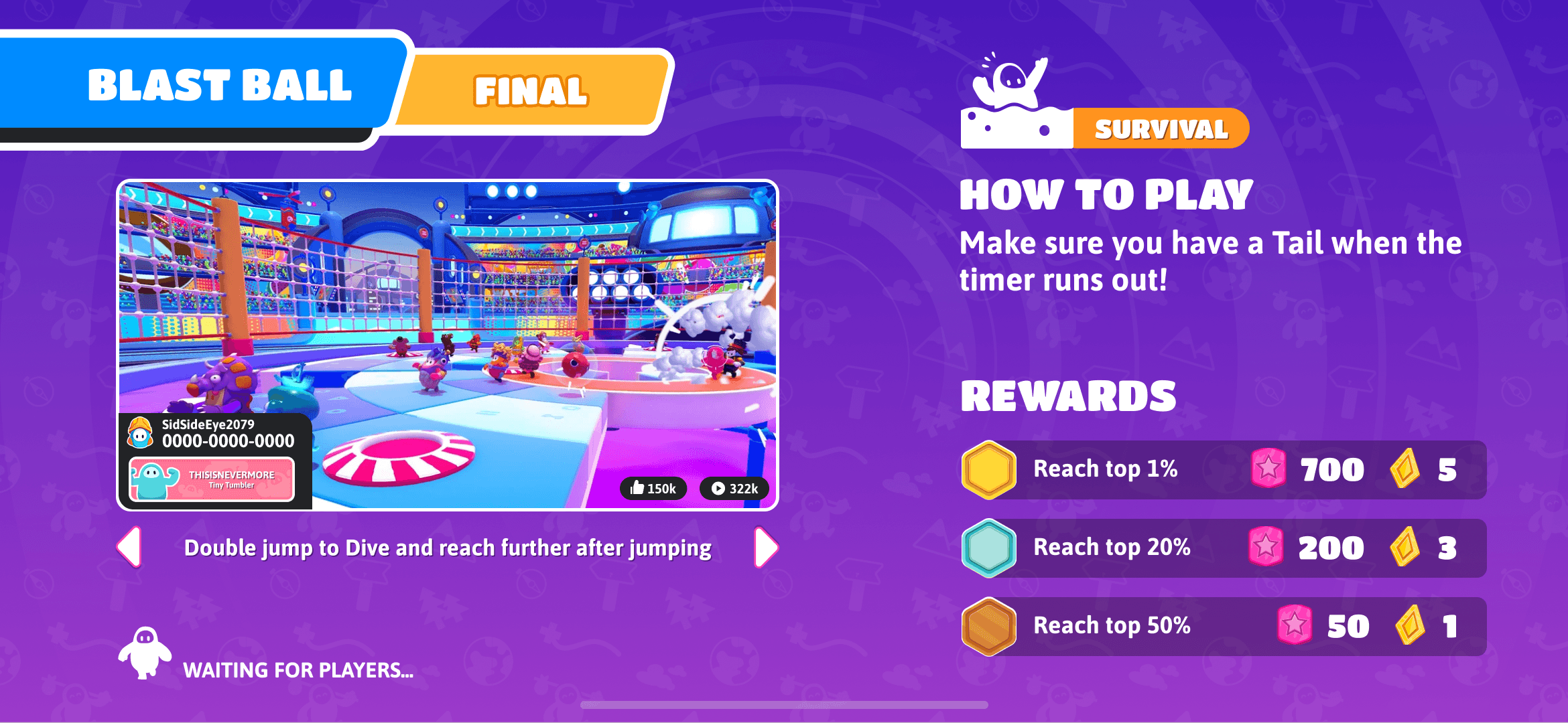
We'd introduced double-jump-to-dive as a mobile-specific workaround — a way to replicate on touch what felt natural on a controller's dual sticks. Nobody asked me to bring it to other platforms. But once the team got used to playing the mobile build, the move became an expectation: switching back to controller or mouse without it felt like something was missing, not like returning to the "real" version.
That gap was reason enough for me to act. I proposed standardizing double-jump-to-dive across every platform, folding a mobile-only workaround into the game's core input scheme, while preserving the legacy input for keyboard-and-mouse players who'd built muscle memory around the original.

02
Clearer lobby hierarchy

Observing players surfaced two problems with the lobby screen.
First, too many elements competed at the same visual hierarchy. The screen felt noisy, with nothing clearly guiding the eye.
Second, and more critically: Fame Pass progression, the mechanic meant to be the main reason to play "just one more game," read as just another element on the screen instead of the compelling driver it needed to be.
I worked with the design lead using my own version of the UX red routes to realign on what mattered most — and least — on this screen, then mocked up ideas to bring to UI for discussion.
Some of the resulting changes:
Play button and game mode made significantly more prominent
Fame Pass progress was redesign to be obviously a button to tap, and repositioned to balancie the screen from the Play button on the opposite corner and creating a visual connection between "why you're here" and "what you're working toward"
Challenges tucked under a single button — the LiveOps team prioritized keeping event notifications more visible than access to your challenges
Added labels to each menu section for clarity after realising iconography alone wasn't clear enough


03
Address FTUE pain points
When I joined the team, no one had had the time to run a proper FTUE study. I conducted one to identify the main barriers keeping new players from enjoying the game — and the touch redesign turned out to be the perfect opportunity to fix most of them, for every platform at once.
Some of the changes:
Enabled auto-grab by default, reducing simultaneous input conflicts and preserving momentum
The game's original concept was built around the feeling of a TV show like Takeshi's Castle — so players didn't select "games," they selected "shows." That metaphor had gotten harder to parse since launch, so I renamed "shows" to "games" for clarity
Reduced perceived waiting time by accelerating flows and adding animation and lightweight interaction, working closely with art, UI, and engineering
We didn't have time to build a full tutorial, and we knew a lengthy one would slow players down — the game's controls are easy to learn, the real challenge is mastering them. So instead, I surfaced commonly forgotten controls during loading screens, making sure the basics appeared on the very first one. Watching players actually read them — and visibly relax into the game — confirmed it was the right call
Reworked the end-of-game flow: players previously had to sit through several animations just to see their rewards, then were forced back to the lobby to play again. I added tap-to-skip, a "play again" option, and clearer reward callouts
Progression had always been hidden between matches. I surfaced it without requiring players to exit the match, in non-competitive modes


Impact
Mobile feeling like the best way to experience Fall Guys
Cross discipline collaboration from day 1 and intensive testing for months led to a mobile-first feeling on a cross-platform title for the launch of the mobile Epic Store
→
Mobile-driven improvements later adopted across platforms:
Double-jump-to-dive standardization
Faster match flows
Clearer hierarchy and less clutter across menus
Skippable downtime
Improved the progression system visibility in menus, in-game and end-match flows
→
Increased sessions lengths for players in non-competitive modes thanks to an infinite play mode
→
Metrics showed that touch players were not significantly disadvantaged by gameplay difficulty
→
We set the bar of touch controls for every other game made at Epic (which led part of the team to take care of the Fortnite touch experience later on)