Role
Sole UX designer leading the redesign of meta systems and onboarding flows
Team setup
Worked across product, UI, art and engineering within a discipline-split production environment.
Impact areas
FTUE · meta progression · menus · onboarding · loading screens · in-game / out-of-game flow clarity
Timeline
6 months (3 staged releases)
Problem framing
Progression clarity issues affecting early and mid-term retention
Crash Bandicoot: On the Run! started as an experimental runner + resource-management hybrid and was later rebranded into a franchise title late in production
→
The accelerated rebrand timeline limited opportunities to validate the first iteration of the meta experience
→
After launch, research showed players were:
· Unclear about what to do next in the progression loop
· Blocked by crafting and ingredient dependencies
· Disengaging during early and mid-term sessions
→
I joined at the start of a full meta UX redesign plan delivered across three releases over six months
The goal
Give players clarity so they can own their progress
The game suffered from an excess of navigation and a lack of clarity.
Players got excited to jump in, but quickly felt overwhelmed by everything required to progress, unsure of where to go next.
I reviewed all existing UXR to understand the game's known problems, played extensively myself, and ran a new FTUE study to build a holistic view of what was actually going wrong.
From there, I structured the work into four areas: attention, understanding, onboarding, and boss encounters.

Key decisions
01
Provide clarity
3D was immersive but hard to navigate
The game had a beautiful 3D island that narratively felt very exciting for Crash Bandicoot players.
However it lacked clear hierarchy and at times, everything could be screaming at players to get their attention. We decided to simplify the navigation by replacing 3D menu environments with clarity-first 2D layouts.

Simple and intuitive interactions
Players used to grab items into slots that felt disconnected from what they were actually building — the interaction itself felt broken, and confusion set in as soon as the handheld FTUE ended and players were on their own. On top of that, players had to remember what they needed to craft, with no support from the interface.
We added a callout that removed the guesswork, so players never had to hesitate or rely on memory, and simplified the whole interaction down to a single clear "Make" button — one that would take players straight into a run to gather ingredients if they didn't have enough yet.
Tutorials felt useless
There were several problems making players want to skip tutorials outright.
Freedom lost
The game took control away from players for far too long during tutorials. That wore players down — no matter how important the lesson was, they'd just tap through to skip it. I audited every tutorial in the game and focused our efforts on the ones that mattered most, only repeating a lesson if the mechanic behind it was genuinely complex.
Readability
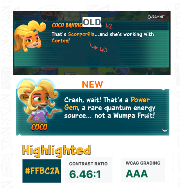
Many players struggled to read the tutorial text at all. I worked with developers to improve color and contrast for better accessibility, and introduced adaptive positioning so each tutorial would appear naturally relative to the element it was explaining, instead of in a fixed, disconnected spot.
Narrative
This was also an opportunity to bring more narrative into the game through Coco, the player's smart sister and guide. I worked with art to build out a range of her expressions, reacting to different events and player actions — turning tutorial feedback into something that felt like a character responding to you, not a system interrupting you.
Focus
On top of all this, it wasn't always obvious which element players needed to look at. We addressed that with HUD masking and contextual hand/arrow cues that could be repositioned for each concept being taught.

02
Making meta systems support gameplay progression
One big problem was that players couldn't understand what to do next, or why.
The core loop had three steps: gather items to craft weapons, use them to defeat bosses, then collect crystal gems to unlock new lands. It wasn't the most intuitive loop in our players' mental model.
Since we had three release windows to ship changes across several months, I focused on two new ways to surface and ease that journey.
The first was a single run button that automated navigation between gameplay and meta, depending on where players were in the loop. Instead of manually choosing the right "game mode," I surfaced exactly where a player stood — gathering, crafting, or fighting — and took them straight into the right type of run with one tap.
By the second iteration, the game, UI, and art leads and I were working in close sync, and sharing my ideas early paid off: together we co-created a much stronger version of this screen. Art and UI's call to bring in animated 3D boss models, or 2D artwork of the next run type, turned out to be the best decision we made on this feature.


The second area was the mission computer, which told players about upcoming bosses. Originally, players could freely pick among four henchmen before facing the boss — but that open composition was confusing rather than empowering. We restructured it into a linear path to reduce cognitive load, visualizing what players would unlock along the way and always making the next progression objective clear.

03
Rebuilding FTUE around progression clarity
I worked closely with the product director to design a new FTUE spanning 20 levels — but a much lighter one than that number suggests
I mapped out every concept players needed to learn and built a Miro board that worked screen by screen, serving as the reference document engineering would follow for implementation.
We were both aligned on one thing early: simply following arrows wasn't going to work. We wanted to give players real freedom at the start — space to poke around and explore, driven by their own excitement to be in Crash's world, rather than being marched through it. In the end, there was still only one path to progress, but we made sure players were never blocked by resources, the UI or ever bored by reading too much.
The result was a flow that felt far more natural, and far less intrusive.
Consolidated legacy research insights and conducted targeted additional studies
Expanded onboarding across more sessions and aligned it with gameplay learning goals
Reduced tutorial hand-holding while ensuring economy systems would not block progression across sessions
We added a similar progression line on the new home screen that would encourage players to gain XP to get rewards.

04
Better gameplay readability
Watching players confirmed something we can never forget: we are not our player.
What meant danger to us, meant healthy to them.
Our first boss threw bouncy, good-looking green balls at players — and instead of running from them, several players walked straight toward them, assuming they were something good to collect. It's an unusual mental model to begin with, moving toward a boss instead of away from it, and the mechanic only made sense once you understood you were meant to get close enough to hit the boss with a crafted item — a payoff that was far from obvious this early in the game.
We reworked the visual feedback around that boss, moved it later in the game, and replaced it with one that fired missiles instead — a threat that reads as a threat immediately, with no learning curve required.
Worked with the art and design team to adjust the visual readability of threats and hazards players consistently misread, improving usability of world objects like mushrooms, which players had been avoiding instead of using as jump triggers
Clarified misunderstood legacy mechanics, such as checkpoint boxes, by replacing them with clearer progression systems

Impact
Turning early confusion into mid-term retention
The numbers showed up from the very first release — which mattered, because this was a race against the clock involving a huge number of people across disciplines. It was genuinely humbling to feel that supported, and to collaborate that closely with every team from day one.
→
KPI impact
↑10% Day-2 to Day-7 retention
↑13% session playtime
↑19% number of runs played
↑5% active users
↑15% ad revenue
Beyond the metrics, the redesign left two lasting marks on how the team worked:
→
Established stronger cross-discipline collaboration between design, UI and art teams during a critical live-service redesign phase
→
Introduced research-driven decision-making across the team, increasing adoption of UX insights beyond UI/UX disciplines and enabling designers, artists and gameplay teams to collaborate directly around player behavior evidence